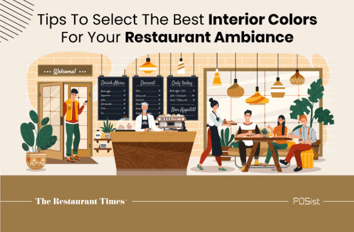
The restaurant interior colors have a significant impact on your customers’ perceptions, how long they stay, and how they feel. When choosing a restaurant’s color and ambience, it’s important to think beyond aesthetics. Customers can perceive your restaurant as a location to grab a fast bite, a place to have a leisurely coffee and dessert, or a place to chow down on a full three-course meal etc, based on the color scheme you choose.
Customers’ food choices and the amount of money they spend at a restaurant are both influenced by the color it sports. Different colors elicit different emotions in customers and can have a significant impact on their appetite and thirst. As a result, distinct colors are required for various restaurant formats.
Colors can make your customers happy, stimulate their appetites, enhance table turnover, and make your dining room appear larger. However, they can also have a negative impact on your guests, therefore it’s crucial to understand how your restaurant’s interior color choices impact its messaging. For example, a street-side diner attracts one type of customer, whereas fine-dining establishments attract a different type.
Bar and restaurant owners need to know exactly who their target market is and make purposeful interior design choices to appeal to that demographic. You must first comprehend color psychology before learning how to combine colors into an attractive and complementary scheme.
The Psychology Behind Restaurant Interior Colors And Its Impact On Customers
In the food and beverage industry, restaurant interior colors contribute immensely to visual stimulation, influencing emotion, and customer behavior. You need to know which colors work well together and how to create a pleasant color scheme. Here is a guide that will help you understand why interior colors are important to your restaurant brand.
1. Light Colors
White and beige have been shown to produce a comfortable feeling in clients, encouraging them to stay longer since they feel welcomed. If you already have a vivid color on one wall, painting the opposing wall can help to produce a relaxing impact. Light colors, such as white and beige, give the impression that a restaurant is larger than it is, but warmer colors have the reverse effect. Lighter hues provide a calming psychological effect, which encourages your customers to stay longer. Customers that stay longer are more likely to order more, increasing your sales.
If you are a smaller restaurant and have a slow-moving menu, lighter colors can be preferable. Restaurants with a high volume of customers daily should avoid using light colors since the amount of time customers spend in the restaurant should be kept to a minimum. For example, white, beige, and grey are colors that reflect everything else around it and are associated with purity and simplicity. It’s also a popular choice for restaurant ceilings. White also gives your restaurant a cleaner, more sanitary appearance.
2. Dark Colors
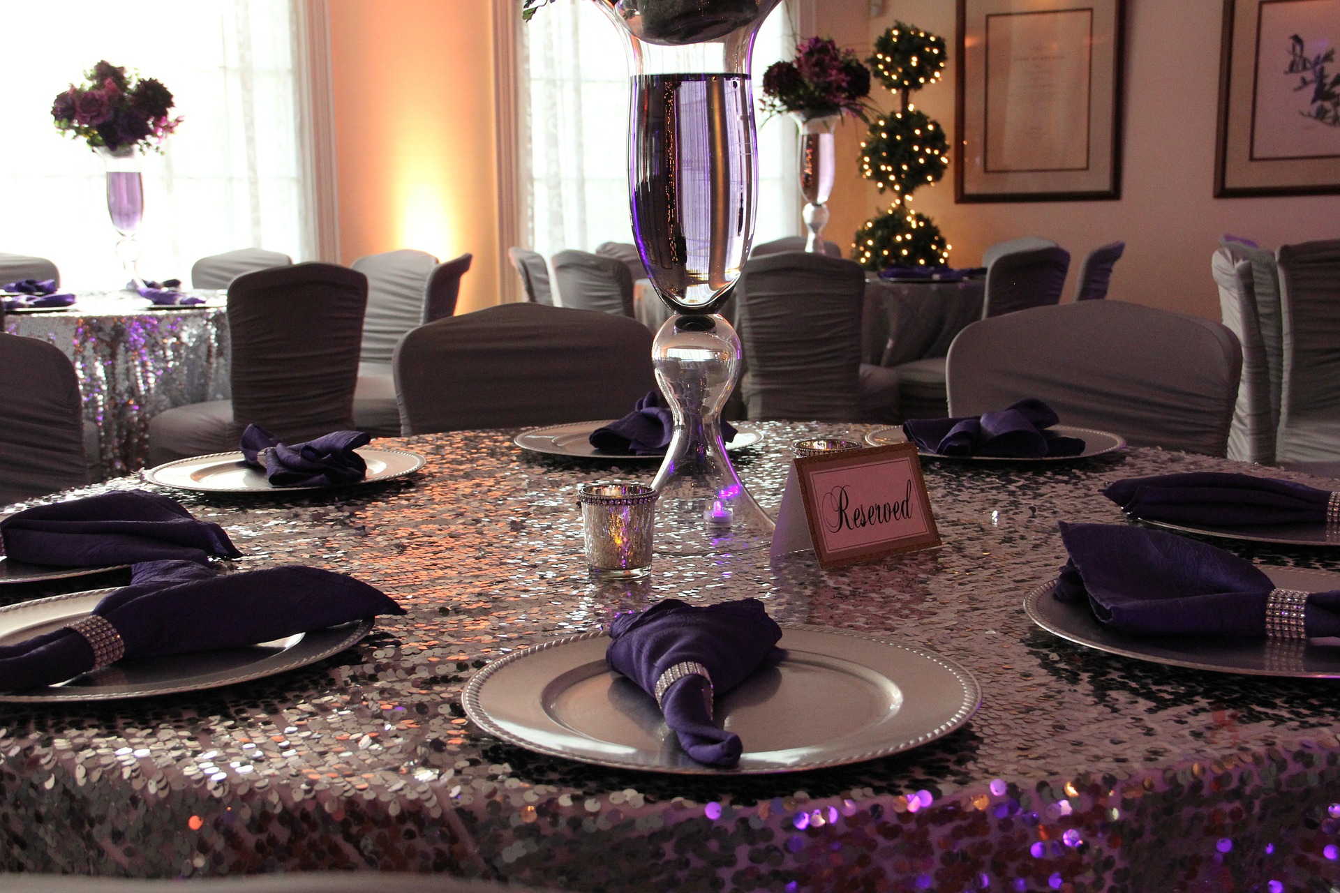
Often dark colors are known as appetite suppressants which means you don’t want to paint your walls with black, blue, or purple, etc. You will often find these colors associated with bars and pubs and that’s because people go for the drinks and not for the food there. If you own a coffee house where you want people to have a relaxing time and enjoy their beverages, blue and purple are your go-to colors.
For example, Cafe Coffee Day makes abundant use of the color purple and is one of the most popular coffee destinations in the country. Dark color schemes are ideal for creating private and romantic environments, making them ideal for bars, trendy restaurants, and romantic bistros. However, if you employ too many dark hues or dark shades, your restaurant will feel claustrophobic and crowded.

3. Relaxing Colors
Green is and has always been the color of nature, and it helps to create a relaxing ambience in the restaurant. It relaxes the customer and makes them want to stay longer. The most essential reason for painting a restaurant green is that consumers want to eat nutritious, well-balanced meals.
A peaceful tone of green, with a tinge of woody brown, should be used on the walls of a health-oriented restaurant. This color scheme has recently gained popularity, and you can now find it in many contemporary eateries. Additionally, color schemes that heavily incorporate green and brown are fantastic alternatives for healthy food companies.
Green is not recommended for clubs and pubs with dark lighting since it looks dreary and dismal. However, you can incorporate colors such as brown, olive green, dark orange, or umber if you have a small chic cafe.
4. Vibrant Colors
Warm hues are vibrant and interesting, and they provide your visitors with a lot of visual stimulation. Because they are the easiest to see, yellow and red are the most commonly utilized colors in logos. Both of these colors raise consumers’ pulse rates and blood pressure, creating an enthusiastic emotion that causes them to eat quickly and depart. The majority of fast food and QSR restaurants have red or yellow walls, as well as red or yellow tableware such as mugs and cups.
However, you don’t want to go overboard with warm color palettes because they can be overwhelming. These colors are only appropriate for venues with a high footfall and a need for consumers to leave quickly. McDonald’s and KFC are two well-known fast-food chains that use color psychology to influence their customers.
Essentially, you must be aware of your brand values (color helps to develop a brand), target demographic, and the message that you want to convey. Set a clear aim for the area while designing it and consider how color and design will work together to trigger the emotion you want to generate. The colors you use to design your restaurant can have a major impact on your clients, so choosing a restaurant color plan is crucial.
Consider what kind of experience you want your guests to have while choosing the color palette. Concepts and themes are important here since they impact the products and, more importantly, the color palette that will be used in the design.
Make sure you don’t choose a harsh color scheme. Conduct research, if necessary, or test the different color schemes on a limited basis and see how the audience reacts; these tactics would be good for the space. The most important thing is to create an inviting ambience for your restaurant, something that is trendy yet timeless, and then deduce the ideal color scheme for your space from there.
Read similar article: Restaurant Branding Done Right: Choosing The Right Colors To Represent Your Restaurant


